
I posted this article to LinkedIn originally on August 1st, 2025.
Start here: https://www.hermanaguinis.com/pdf/PPsych2012.pdf
Go read the article. All of it. Science is hard! When people say “I’ve done the research,” ask them what papers they’ve read. If they say “I got it off LinkedIn” or “I’ve done my research on Facebook,” laugh at them. But if they say “I got it from this paper,” and provide a link to that paper, and they’ve actually read the paper … well, maybe believe them, maybe not, but please don’t laugh at me.
Ok? Did you read it? Good. But if not, and you really only want the TL;DR, the premise is that a “normal” or “Gaussian” or “bell” curve is not the correct way to model the distribution of talent.
Talent is a power curve. Or, more precisely, a Paretian (power law) distribution. The paper combined 5 studies of different professional fields from acting to singing to NCAA football to Major League Baseball, and showed that for objective measures of talent, the χ-squared fit for a power curve is a billion times better than a Gaussian curve. Not the hyperbolic billion – literally an average χ-squared misfit of 2,092 vs. 2,769,315,505,476 in one of the studies.
So, by now you should be convinced that talent is a power curve, not a bell curve. So what?
Well first, it’s very important to notice that a Paretian distribution is “scale invariant.” [https://en.wikipedia.org/wiki/Scale_invariance] This means that if you cut off the curve at any point, and re-plot the resulting curve, the NEW curve is ALSO a power curve. So if you pick a particular metric, like the number of career home runs, you’ll get essentially the same curve for AAA minor-league baseball that you will for Major League Baseball, even though most every MLB player is probably better than every AAA player. Similarly, if you cut off all the MLB players below the 50th percentile, and re-mapped the ones that are left, the same distribution emerges. This will become relevant later.
Next, let’s discuss human perception.
Since talent is a power curve, it’s easy to tell the difference at the top end of the scale. The difference in performance between the 90th and 95th percentiles is much larger than the difference in performance between the 5th and 10th percentiles. So it’s easy to tell who your top performers are, but hard to tell who your bottom performers are.

To put it to practice, let’s say you use lines of productive code as your objective measure (I know it’s not, but go with me, here). And let’s assume the worst coder at the company can write 100 lines of code a week. That means the 5th percentile performer will write 103 lines of code, and the 10th percentile performer will write 105 lines of code. On the other hand, the 90th percentile person will write 316 lines of code, and the 95th will write 447 – over 40% more than the 90th percentile coder, which means the gap between “worst” and “average” is smaller than the gap between 90th and 95th percentiles.
But now you’re a director, and what do you do when you’ve got a group of 10 people in each range, and you had to stack rank them? Take the image above and draw ten lines between the 5th and 10th percentile, without overlapping them. I’ll wait. While you do that, I’ll do it in the spread between 90th and 95th, and we’ll see who finishes first.
(The above chart, and the data I derived from it, is a Pareto distribution, with m=1 and α=2, for anyone that wants to double-check my work. That means the midpoint / 50th percentile is right at √2, or 1.414. So the “average” coder would produce 141 lines of code, which is the green line in the chart above. I concede that coding talent may not be m=1 and α=2; maybe it’s m=3.14 and α=2.718, and maybe it changes from company to company. I assert that my point still holds, and regardless of your function parameters, the relative difference between the 5th and 10th percentile is vastly and obviously smaller than the difference between the 90th and 95th percentile.)
I assume, by now, that you agree that discerning the difference at the bottom of the scale is much harder than the top. So let’s put that aside, just for a minute. Keep it nearby, though, because we’ll come back to it.
Amazon uses a stack-rank system to strictly enforce “The Curve.” According to Business Insider [https://www.businessinsider.com/amazon-annual-performance-review-process-bonus-salary-2021-4] the curve is: LE 5%, HV1 35%, HV2 25%, HV3 15%, and TT 20%.
But when do you enforce it? If you have 5 people that report to you, how do you apportion 35% of them to HV1? You kinda can’t have 1.75 people ranked HV1 (at least without a chainsaw, and I’d argue you shouldn’t even then). So let’s assume, for the sake of argument, that Amazon strictly enforces The Curve on organizations as soon as they reach 40 people or more.
Ok, seems alright, no? 40 people? That should be large enough to even out, right? Nope.
Turns out there’s a function that nicely describes the likelihood of X occurrences in Y events, when the expected outcome is Z occurrences. It’s called a Poisson distribution. [https://en.wikipedia.org/wiki/Poisson_distribution] You can model this pretty easily in Excel, by generating random numbers for cohorts of 40 people, then mapping how many actually end up in LE, HV1, HV2, and so on, assuming strict application of The Curve. I did it for 100,000 cohorts of 40 people, and my results vs. the predicted Poisson curve matched quite well.
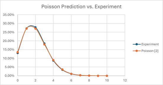
When you run the numbers, if you have a bunch of cohorts of 40 people that you’re trying to stack rank at Amazon, about 13% of your cohorts will ACTUALLY have 0 LE employees, 27% will have 1, 27% will have 2, and the remaining 33% or so will have 3 or more. There’s about a one-in-twenty chance that you’ve got 5 or more in your group!
But… you’re mandated to fit The Curve. So if you do your job “correctly,” and walk into OLR with exactly 2 LE employees in your group of 40 people, there’s a 73% chance that you’re wrong.
Just plain wrong. Not maybe, not sometimes, not “only if you’re a bad manager” wrong. By definition, and by design, you’re wrong. (Probably.)
Furthermore, if you apply The Curve on cohorts of 40, and run a large simulation (or just apply the statistics), you will discover that 53% of people who should be LE… are incorrectly rated HV1. And on the flip side, for each person in your cohort rated LE, there’s a 53% chance that they’re actually HV1.
So even if we assume perfect information, the result of the above policies (i.e. enforcing the curve on orgs when they reach 40 employees) will be that more than half the people that end up LE shouldn’t be there, and that more than half the people that should be LE, aren’t. And ALL of this is assuming that managers are completely unbiased, that there is some objective measure of talent, and managers are able to accurately and precisely measure it.
And that’s where we START. And it’s going to get worse, because it’s time to start questioning those assumptions.
Ok, now let’s go back to the paper I cited earlier. Talent is a power curve, right? And it’s hard to tell the difference between, say, someone at 3% versus someone at 7%, right? Because that’s what managers are asked to decide when they’re putting people in the LE bucket.
Unfortunately, the ability to accurately assess talent is, itself, a talent. And that would mean that there are managers that are TERRIBLE at assessing talent. And if you think “Amazon only hires managers that are good at assessing talent,” go back and reread what I wrote about scale invariance.
If 5% of individual contributors are LE, that means that 5% of managers are also LE. And in fact, because talent is a power curve, there are actually a LOT of managers that are relatively BAD at assessing talent accurately. Using my example above, half the managers are only 0-to-40% “more accurate” than the WORST manager at the company. Sure, there are some that are three or four times better than anyone else, but that’s only the one-manager-in-20 at the top of the curve.
But something funny happens if you try to add incompetent managers into the simulation. If you go back and run the simulation, this time adding “error” to some of the rows … the incompetence of the managers washes out in the error inherent in enforcing the curve. Since 53% of people that are LE are already (incorrectly) in HV1, then it’s a coin flip as to whether an incompetent manager down-levels someone who SHOULD have been downleveled in the first place (stumbling their way into the right decision) versus downleveling someone who shouldn’t have been. And since 53% of people in LE aren’t actually LE, it’s again a coin flip as to which one the bozo picks to uplevel.
Therefore: even assuming the “normal” levels of incompetent managers, the system itself is so broken that you still end up with a 50-50 shot whether someone’s really LE or not.
But this is only MOSTLY broken.
Where things COMPLETELY break is when biases come into play. Management tries hard to root out unconscious (or even conscious) bias, but you just can’t. Individuals are discussed in OLR for 10-15 minutes at most. If a manager wants you to be LE, and you’re borderline, you’re going to be LE, and they’re going to be able to make a case for it. Remember – we’re trying to compare Mr. 4% to Ms. 6%, so we’re talking about the difference between 103 and 105 lines of useful code per week. Or check-ins per sprint. Or defect frequency during peak. Or whatever semi-objective measure you try to trot out.
Ask yourself, which engineer is better: the one that had twelve more checkins last year? Or the one who caused two fewer sev-2s? Or the one who completed 0.26 more story points per sprint on average? Or the one who blocked the pipeline 3.3% less often? You’ve got 10 minutes to decide which two of these four are LE.
So, apologies that this was so long, and if you actually read the paper, gold star to you for sticking it out. But to sum up:
- Talent is a power curve.
- Therefore, telling the difference between your lowest performers is extremely difficult.
- Therefore, combining top-grading (where you fire your bottom X% performers) with an enforced curve produces coin-flip outcomes by design.
- Manager competence does NOT impact outcomes, because there are a lot of semi-competent managers (remember, their competence is ALSO a power curve).
- Biases, on the other hand, DO affect outcomes.
- And because the difference between the bottom performers is indistinguishably small, bias is all that’s left to decide who gets LE and who doesn’t.
- But top performers? They’re easy. They clearly burn the brightest and do the most.
Discover more from Space on the back porch
Subscribe to get the latest posts sent to your email.

Pingback: You Gotta Do What Makes You Happy | Space on the back porch